For week three, I created an infographic on the need for diverse literature using Piktochart. Prior to using this webtool, I spent some time exploring Canva and Easel.ly. Canva was easy to use with its drag and drop features, but too many items I wanted to incorporate into my infographic required a fee. Also, I wanted to create graphs and the free graphs were pre-set without the option to edit them. I had to create a graph using another website, NCES Create A Graph, but soon after, I decided that my efforts were very time-consuming. Easel.ly was also easy to use, but I didn’t like that many of the options were not available or limited. I felt restrained with Easel.ly’s themes and design options, so I went with my favorite of the three, Piktochart. For me, this website is more visually appealing, easy to use, and offers a wide variety of design options, which I prefer.
I have used Piktochart before, so I spent less time creating this infographic instead of learning how to use it, unlike with the other websites. Using this website requires patience, especially when rearranging text and graphics. If viewing the infographics on a mobile device, the infographics are not responsive.
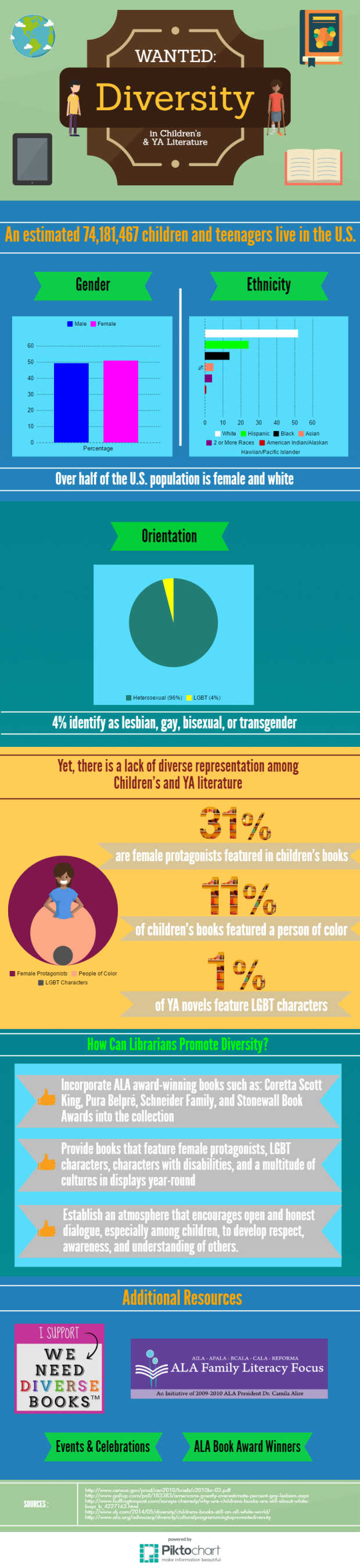
My infographic is more interactive on its website. You can click on the image and it will direct you to its website. The image itself wasn’t saved with the static numerical data for the graphs, but if you hover over the data in the graph at its website, you can see the numbers. Also, the additional resources are linked to its corresponding websites. To view them, click on this infographic. From there, scroll down to the Additional Resources section, and click on each of them.
Tips for Students Creating Infographics:
- Take time to explore the available online creation tools.
- Tell a good story.
- Design with simplicity.
- Make it visually appealing.
- Use reliable sources and fact-check your data.

I really like this! It’s very colorful, but easy to read. I especially like the graphs you included.
LikeLiked by 1 person
I think you did a really good job using the changing colors for each section. Great job using space while keeping it from becoming too cluttered.
LikeLiked by 1 person
I really had a maps, graphs and charts block (like writers block) when I worked on my infographic, I had no idea what I would do. I am amazed with the creativity, and design here with the different colored sections.
LikeLiked by 1 person
Wow, this is fantastic! I really like your creativity that you used here and I also like the content that was included. Very relevant and useful information, with some great tips to use in the future! Well done!
– Jillian
LikeLiked by 1 person